

A Living Identity for a Collective Mission
The art direction for the Communauté des Entreprises à Mission was developed by another designer and is built around a clear, structured visual language. A minimal, eco-conscious system balances business and human values through a vibrant blue and energetic orange palette, softened by earthy tones, reflecting an evolving collective movement.
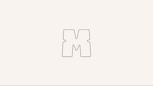
I was brought in to animate the identity and bring it to life through motion. At its core, the bold “M” slowly assembles into collective strength and layered symbolism from target to puzzle piece. Shaped by connection and cohesion, reinforcing the idea of community. Fluid transitions between blue and orange color gradient express the dialogue between business and human dimensions, adding rhythm and depth. It portrays a warm community in motion, constantly evolving and focused on impact.

Credits
Art Direction: Emma Barrus
Animation: Lio
Sound Design: Lio